Real Estate Heatmap Dashboard
Problem Statement
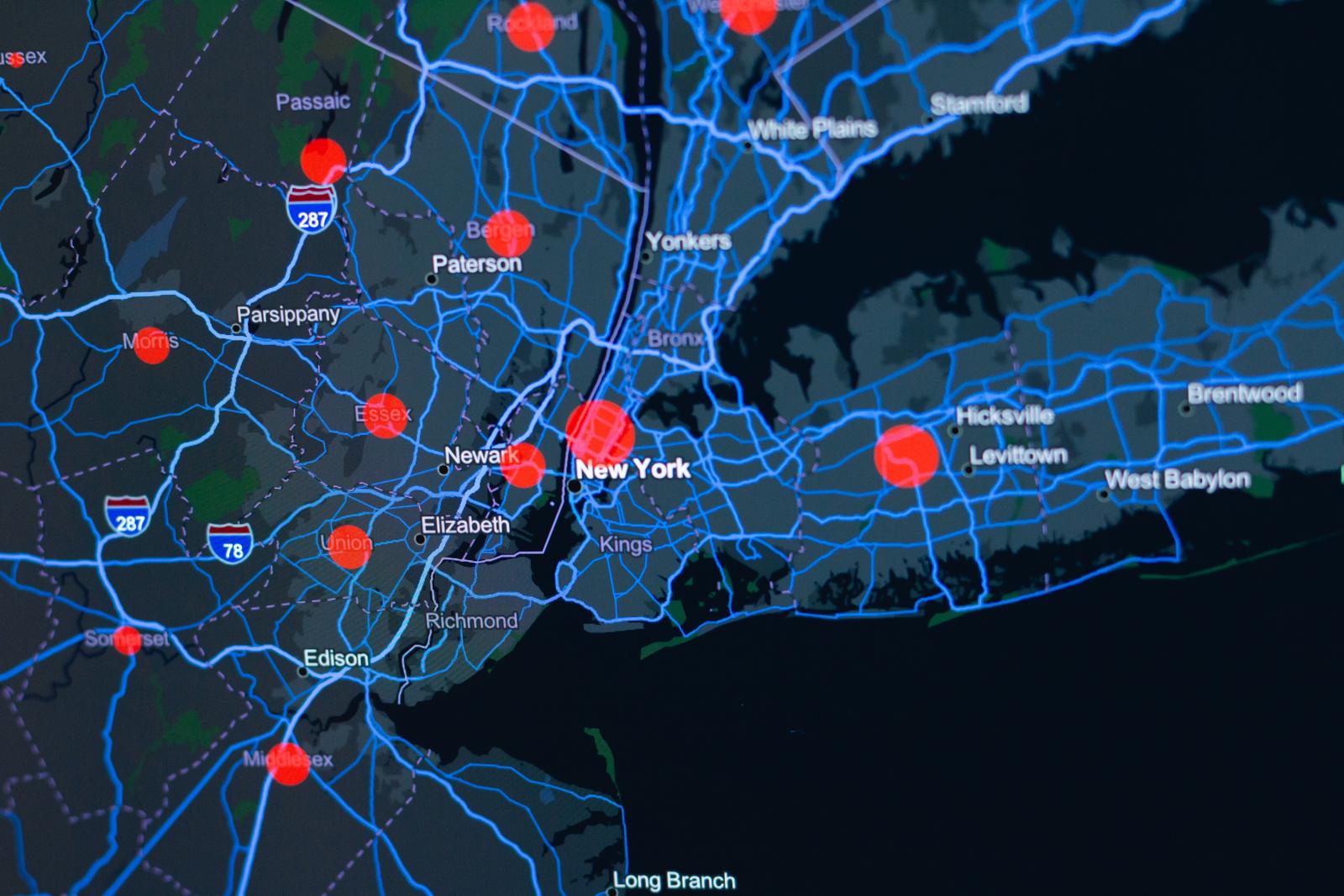
Neighborhood-level housing data is publicly available from Redfin, but it’s released as massive flat files with no geographic context or cross-market comparison. Buyers, sellers, and investors need a way to quickly compare pricing, inventory, and market speed across metros and drill into specific neighborhoods - without writing SQL or building their own pipelines.
This project transforms raw Redfin data into an interactive Streamlit dashboard covering 7 U.S. metro areas and 1,262 neighborhoods, with heatmaps, rankings, and market velocity analysis.
Methodology
Data Pipeline
The Redfin Market Tracker dataset is ingested as neighborhood-level quarterly data (August 2023, 90-day trailing window). A Python pipeline filters to seven target metros (Austin, Boston, Chicago, Denver, Miami, New York, San Francisco), coerces types, geocodes neighborhoods, and outputs cleaned CSVs. The dashboard is built with Streamlit, Plotly for interactive charts, and Folium for geospatial heatmaps.
Results
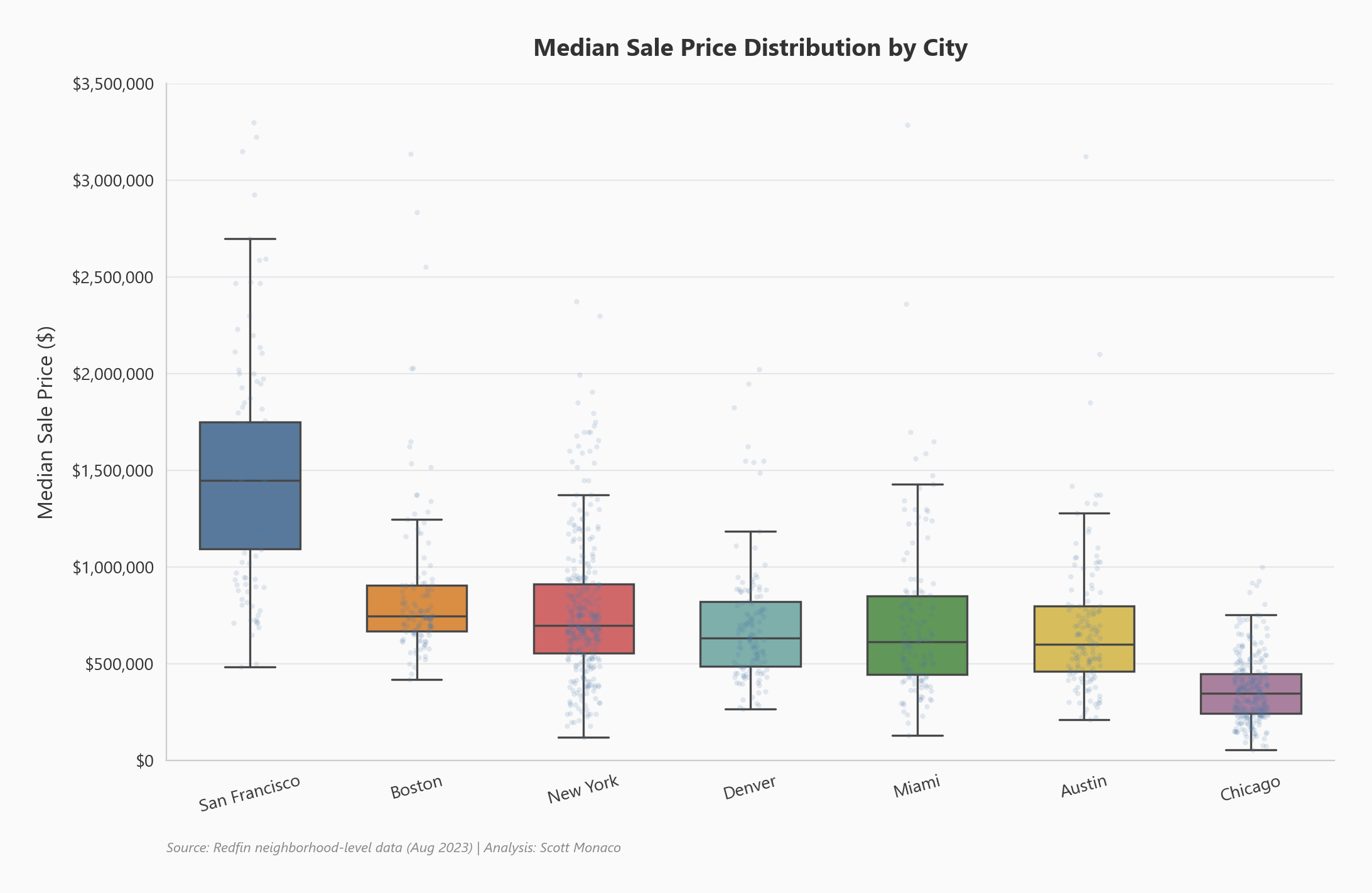
Price Distribution by City
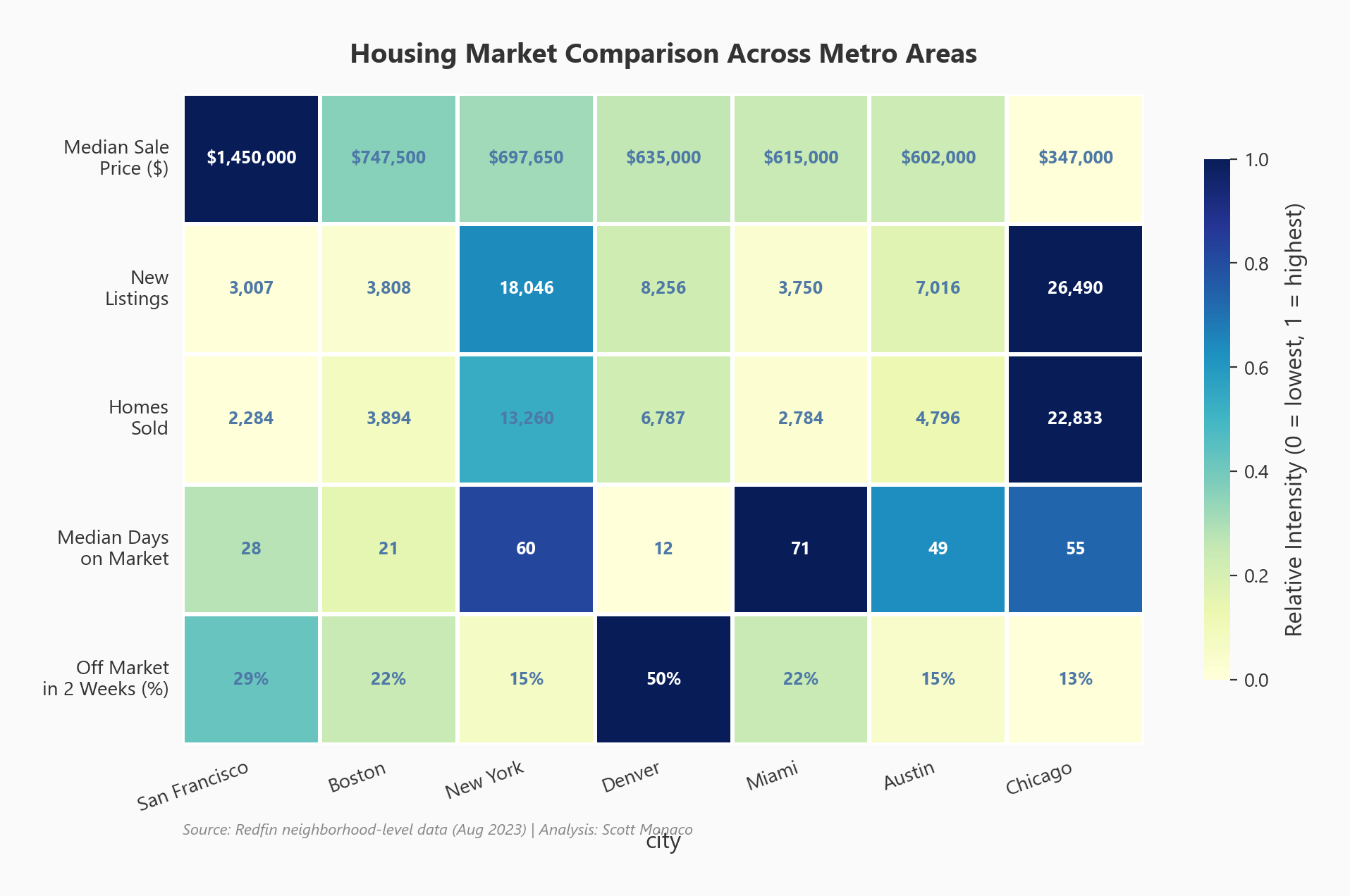
City Metrics Heatmap
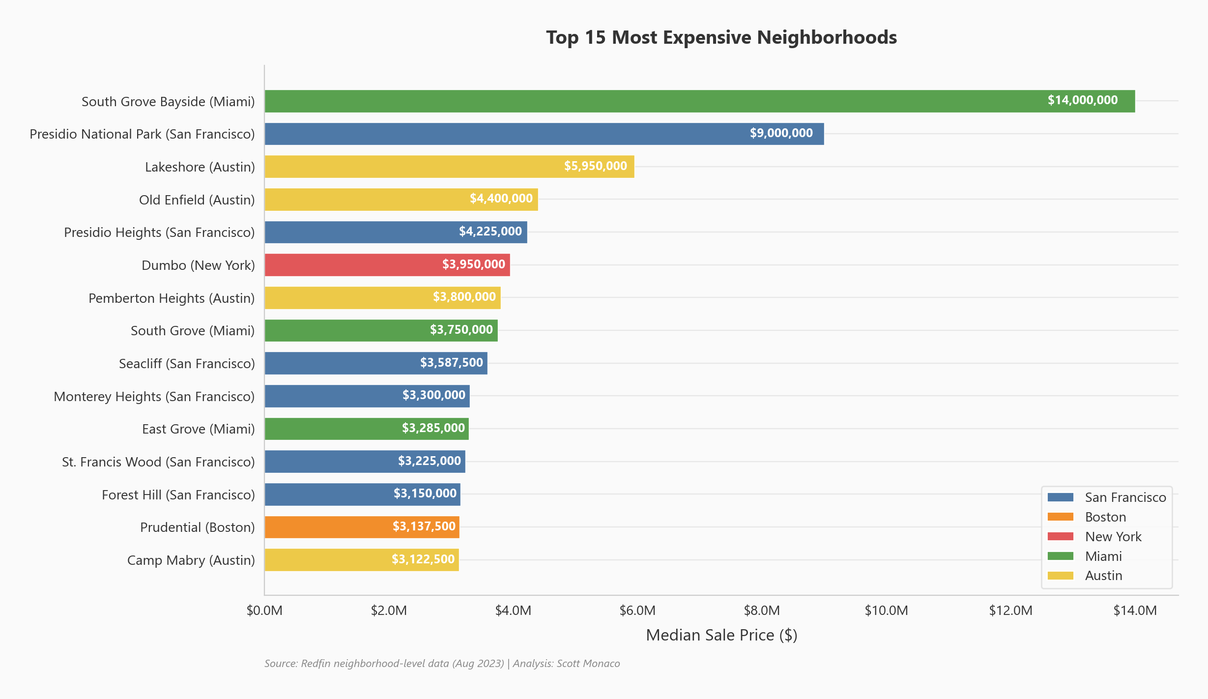
Most Expensive Neighborhoods
Price Variance Analysis
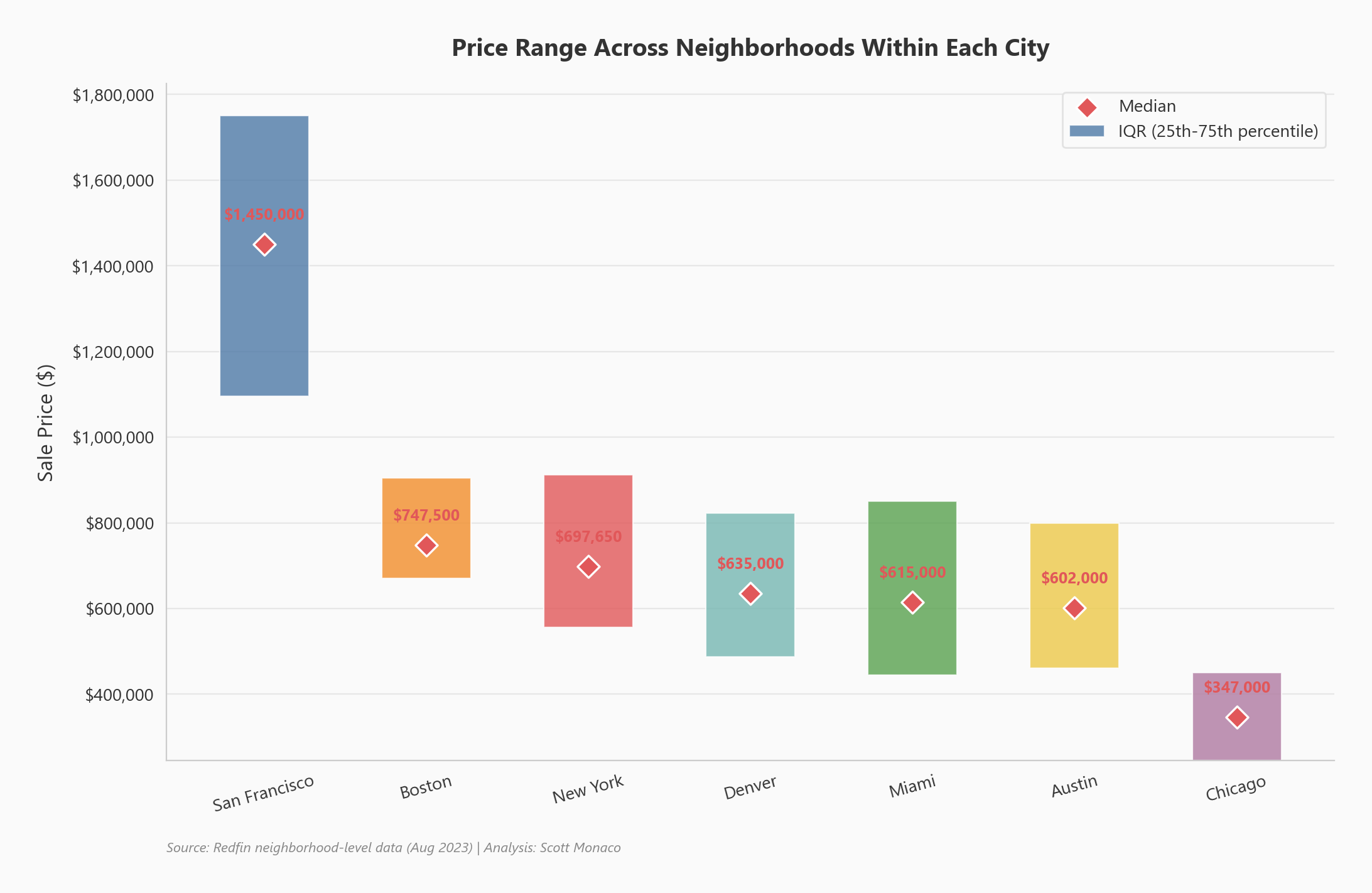
Market Velocity
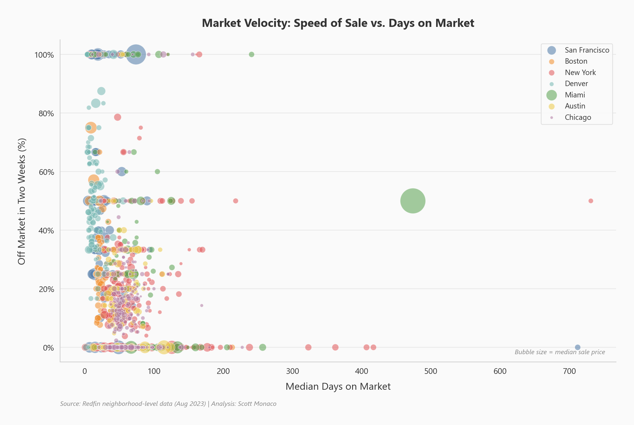
Next Steps
- Automate quarterly data refresh via the pipeline scripts
- Supplement Redfin data with Zillow pricing data for a more holistic view
- Build a predictive model for future median sale prices by neighborhood for ROI-driven investment